
ARTICLES
BY JOHN TAN
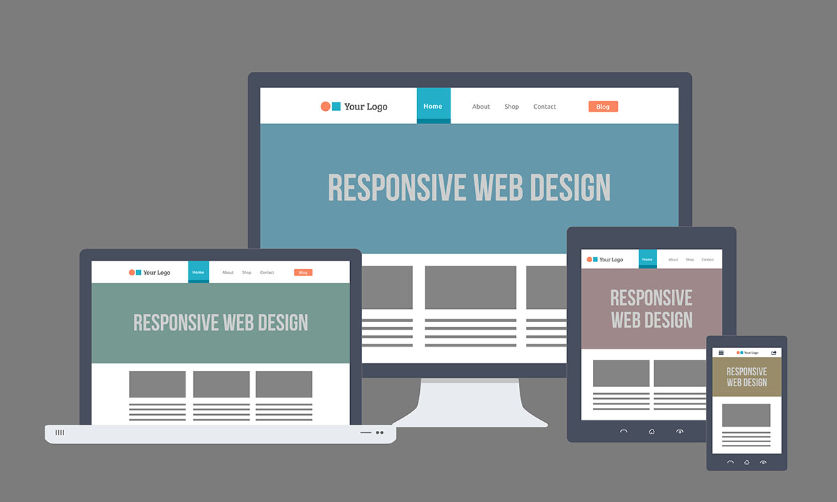
7 Common Mistakes When Designing A Responsive Website
Due to the change of technology and lifestyle, more people across the world are now accessing websites using mobile devices. Reports have shown that 7 out of 10 people are now using mobile devices then desktops to view websites.
And for this reason, many companies had already revamped their desktop version only websites into responsive (mobile friendly) websites.
But if we are not careful, mistakes can be made when designing a responsive website, which will affect the rendering of the mobile websites, it may even affect the indexing or ranking of your websites from major web browsers.
Here are some of the common mistakes a webmaster make when designing a responsive website.
1. Blocked JavaScript, CCS and Image Files
Google-bots (Google browser) or Bing-Bots (Yahoo browser) are web crawling bots, also known as "spider" which, crawls into websites to discover new and update content and images. The content will be indexed for users to see when they do a search in the web browser. If JavaScript, CCS and Image are blocked from bots to crawl when using robot.txt, it will directly affect the render and intended script of your website content and image. This can result in suboptimal ranking.
What you should do:
- Ensure that bots are free to access the JavaScript, CCS and Image in your website. Check your robot.txt carefully before uploading to your server.
- Test the responsive website with Google Mobile-Friendly Test to see if your website is compatible for mobile users.
- Double check your responsive website on desktop and mobile devices to ensure the rendering results are to your expectation.
2. Unplayable Media Content
Media such as video, music and animated content which are unable to play in the mobile website will directly affect user experience when they visit your responsive website.
What you should do:
- Use video or audio embedding script which are compatible in both desktop and mobile devices.
- Use HTML 5 standards for animations to give a smooth playing experience for users.
3. App Download Interstitials
Some companies like to promote their business' app using pop-ups in mobile devices. But if webmasters are not careful, it may disrupt the users' usage of the website. (i.e. pop-ups covering the main content of the website). Mobile devices screen are limited and webmaster have to consider how to place the pop-ups without affecting users from reading the main content when designing a responsive website.
What you should do:
- Avoid full screen pop-ups to cover the entire page. Webmaster may consider to place the pop-ups on the top side of the screen with an obvious "Close" button, the pop-ups should not cover any part of the main content of the website. Users may then have a choice to dismiss the pop-up if they only want to read the website content.
- Do not force users to accept pop-ups in order to read the main content. It will affect users interest to re-visit your website.
4. Slow Mobile Pages
Fast loading website content (i.e. video, audio images) is always a priority webmasters should look at when creating a mobile friendly website. It can be frustrating if user have to wait for a long time for the webpage to be fully load. Remember, user will only stay at your website for 10 seconds before deciding to continue reading from your website or to move on to another website.
What you should do:
- Proper compression of video, audio and images to mobile compatibility.
- Provide choices for user in video resolution format they want to see. (i.e. 360, 720, 1024 or HD format).
- Use Google PageSpeed Insights to check your website for issues which can slow down your web-pages.
5. Set Viewport Correctly
Different devices comes in different sizes. Responsive website pages should set to suit the screen for all devices by using meta tag. This meta tag will then tell the browser to adjust its' screen size according to different devices.
6. Small Font Size
Font should not be set too small for user to read when using devices to view your responsive websites. Use legible font size when design your websites. A 14px font size is recommended. However, you may adjust the font size accordingly that best fits your website.
7. Touch elements too close
Buttons or links are commonly used for viewing different pages within a website. And so, webmaster need to consider the placement of the buttons which, can be easily "touch" by users.
A good guide for a button must have at least 7mm or 48px width and height and the minimum of 5mm or 32px blank spacing between 2 buttons.
Disclaimer: some of the content of this page are extracted from Google Developer.
Related Articles
These articles might be interesting for you as well:


